Part 2: Days 6 Through 11
Not going to lie, I was a little less excited about the sixth day of this challenge after the fifth day’s design prompt gave me such challenge. But when I saw it came through, I was pleased. I didn’t get to work on it right away, on account of a rather busy Sunday, but I did spend some time thinking about it.
At this point, I’m still trying to not spend too much time working on these. However, since the whole point is to sharpen design skills and build creativity, I figure I might as well spend a little more time on them if I have a vision in mind. With that said, let’s dive in…
Day Six: Coffee Shop
The sixth prompt was coffee shop, with the following name suggestions: Dylan’s Coffee, The Roasted Bean, and Tazza. This was a welcome reprieve from day five’s challenge, and as a coffee-lover, this one spoke to my heart. As I sipped on my own coffee (for inspiration, of course) I thought about words I associated with coffee. I briefly tossed around the idea of doing a cat-themed coffee shop logo using the name “Toebeans” which came to me after I thought about coffee beans, but opted for something that could perhaps be expanded a little bit more. I settled on “Bru Coffee”. I figured it could start as a coffee shop, but things like tea, kombucha, and even beer wouldn’t be out of place in a shop called “Bru”.
Here is my day six logo design:
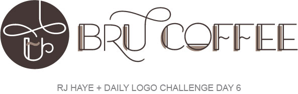
I started this like most of the others: by going through my fonts. I ended up with what was sort of an art deco font that I chose because I liked the shape of the “U”. And then I looked at the glyphs, and was blown away by the amount of variations available for each letter! I was able to construct this logo using only available letters. I rotated the “O” in “coffee” so it looked a little bit like a cup with coffee in it. The “F”s were created using upside down “L”s from one variation and a “~”. Everything else in “Bru Coffee” is an available character in the font I chose.
The logomark in the circle was also created with various letters from the same font, though I sort of Frankensteined it together. It came out exactly how I wanted it though, so I’m pleased.
I chose a dark brown color because, well, obviously it reminded me of coffee. It wasn’t quite doing it for me, though. The open space in the letters and the plain brown logomark were a little boring. I was initially going to just fill the spaces with a color that looks about like my coffee when I drink it, but an accidental arrow over gave me the idea to shift the fills and add some dimension. I added a swirl in the same color on the logomark for a little extra dimension and to tie it all together.
Things I might refine:
I don’t think I’d change anything here. Prior to settling on this I played with making the “steam” swirl the light brown, to look like coffee going into the cup. It didn’t work. Adding the tan block instead of the swirl on the logomark didn’t work either. Overall, I’m pretty happy with this one.
Day Seven: Fashion Brand Wordmark
For day seven we were to pretend like we’d just been hired to create the logo of the next big fashion brand. The suggested names offered were OAKAO, Deities, and Adams & Abigail. This prompt clarified that “a wordmark just means the logo uses only modified typography. This means there is no “logomark” just a “logotype”. Take a look at other major fashion labels for inspiration, many use a wordmark.”
I joked with a friend that I should create a dog fashion brand and call it “Mongrel”. They said, “make it sound more French and you’re on to something!”. So I did!
Here are my day seven results:
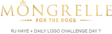
I spent a little more time on this one, mostly because I wanted a metallic gold effect but didn’t quite know how to do it. A quick search and I discovered there’s a newer tool in Illustrator that allows you to create custom gradients and it works really well for generating metallic effects. It’s called the Freeform Gradient Tool. I followed this tutorial and, after quite a bit of playing around, got something I was happy with.
Things I might refine:
Absolutely nothing! I’m ready to start up this high end dog fashion brand right now! Semi-joking, but if anyone wants to talk, drop me a line.
Day Eight: Ski Mountain Logo
Day eight’s challenge was a ski mountain logo, with the name suggestions listed as Brass Peak, Mount Blanco, Traverse, or Snowdrop. I settled on Traverse because in my head I saw a ski jump in the “T”. But things took a bit of a different turn when I started thinking about colors. For some reason, I associate skiing with 70’s type puffy jackets, with color-blocked stripes. Thinking about that, I opted to go in a totally different direction.
Here are my day eight results:
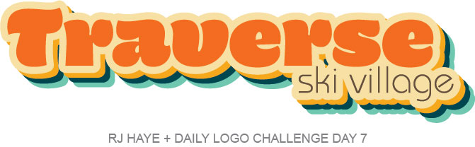
Once I decided to go the 70’s route with this, I knew I wanted something that would essentially look good on a ringer tee. Possibly in glitter. I didn’t have a font that worked for what I envisioned, but I did like the skinny font I have for “ski village” here. So I headed over to Adobe Fonts and snagged a couple that I thought might work. When I brought them into Illustrator and paired them with what I already had, this one was the clear winner. The little upticks on the letters made me think of ski jumps. From there I searched for 70’s color palettes and snagged a screen shot one of the first ones. I used that as a base for the colors I wanted, modifying them a little and adding the deep brown used in “ski village”.
Things I might refine:
I really don’t think I’d change anything here. Maybe I’d add a couple more layers of drop shadow if I wanted to bring in more colors. But otherwise, I’m really happy with this. I low key want it on a ringer tee.
Day Nine: Streaming Music Startup
Day nine brought us a streaming music startup prompt with Beat, Pitch, and Bass as the suggested names for our fictional company. The prompt also included the reminder to, “Make sure to position yourself to be different than the big three players in the industry (Spotify, Apple Music, Soundcloud). Remember their colors are green, blue & red, and orange respectively. Try to choose a color that makes your logo stand out!” which was very helpful.
I started this project a little different because of that reminder, and looked up the logos for Spotify, Apple Music, and Soundcloud, and added Pandora in for good measure. Once I found them, I dropped them into my working document to keep in mind their colors, their look, and also remember what I might need in my logo (particularly an app icon). And then I worked on the name. I didn’t particularly care for the suggestions they gave, but “Pitch” reminded me of my grandpa, who had perfect pitch. Thinking of him made me think about the fact that at least once in my lifetime, one or both of my grandparents asked, “what’s that noise you kids are listening to?” and my streaming music startup was born.
Here are my day nine results:
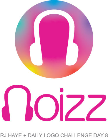
I thought the unique spelling might make this stand out a bit more, and the shape of the “z” reminded me a little of music notes. I went with a bright magenta color because it was so different from the current popular streaming services, but opted to sort of bring in some colors similar to current ones in an effort to summon some subtle familiarity. I made the “N” into headphones by duplicating the dot of the “i” and cutting it in half, and it works really well in an app icon. Overall, I like it.
Things I might refine:
The only thing I might work on is the gradient and the colors in the app icon. I’m not sure I totally love it the way it is, and I’m not sure if it’s because of all of the colors I used, the colors themselves, or how symmetrical it is. I played around a little and had trouble settling on something I loved and just kind of went with this so I could be done. If I were working on this for a client, I would for sure spend more time on it and get their input. For this project, it is what it is.
Day Ten: Flame Logo
The tenth day of the challenge was a flame logo, with the name ideas offered up being Sizzle, Liight (or Light), and Flint & Flame. As an additional assistance, we were told the logo could be for a restaurant, grill, or firewood company. I opted to go with Flint & Flame because I wanted to do one of those sort of trendy X logos. Here’s what I came up with…
Here are my day ten results:
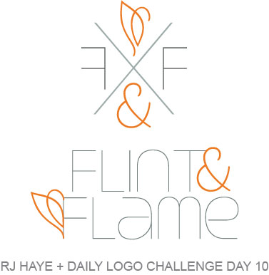
I’m not quite sure what kind of company this is for, but I’m leaning towards a fancy candle company. I went with an orange that reminded me of the top of a flame and a dark steely grey that made me think of flint. I made the X a lighter version of the steel color and reversed the F on the left side for some extra symmetry.
What I might change:
I’m not sure. This is one where I might defer to the client, if there was one. I’m not 100% into the flame-like shape because it looks a little like a swan to me. Removing the loop on the right side of it might clean it up a bit, but I liked that that gave it a little bit of a delicate touch. I could nix it from the “F” on the wordmark–I was back and forth on it there to begin with–and that might do it for me.
Day Eleven: Daily Logo Challenge
For day eleven of the Daily Logo Challenge we were asked to design a new logo for the Daily Logo Challenge. The prompt said, “We will change our logo every month using a logo submitted by you! We will credit you and update our website and social profiles.”
I’ll be honest, this one rubbed me the wrong way a little bit. Or a lotta bit. Designers, and creatives in general, are notoriously asked to do things for free in exchange for exposure (instead of proper monetary payment) and I don’t really see how this is really all that different. In fact, it really isn’t! But in the spirit of… whatever it is I’m trying to do here, I did a logo for day eleven.
My day eleven results:
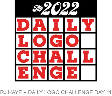
I had a vision for this to look like a calendar. Doing a standard seven day calendar didn’t work with the number of letters in all three words, so five days it is. I went with a red that, when I went back to the website, isn’t quite the same red as what’s there, but whatever. I’m not submitting this for use by them because I don’t need or want the exposure.
Admittedly, I phoned this one in. Granted, I looked at the website and it hasn’t been updated since I started the challenge (and I’m writing this post on day 14 or so). The last instagram update on the account is from 19 weeks ago. So I’m pretty sure that it’s not a currently-running thing, which makes sense.
Things I might refine:
Frankly, nothing. I didn’t even really want to do this one because what a great way to get a bunch of free logos for your website than to use what’s supposed to be a fun way to flex your design skills and learn new stuff to do so for free. But I wanted to stick with it, so here we are.
Overall thoughts up to this point.
I was all about this whole thing until I saw day eleven’s prompt. I was ready to give up then, but had guests in town for the weekend, so I didn’t do days eleven through thirteen when they came in anyway. And while day eleven’s prompt left a bad taste in my mouth, the following days were less “do it for the exposure” and back to some fun stuff, so I’ll keep going. I have already learned some new stuff and I’ve had fun with things up to this point, so why not?