
Part 1: Days 1 Through 5
Someone in one of the design groups I’m in posted about the Daily Logo Challenge and I immediately jumped on the opportunity to flex my creative wings a bit. The project is 50 days of prompts you then use to create a logo. I don’t get to do a lot of logo design in my everyday work, and don’t do a lot of freelance work because it’s often not how I want to spend my time after work. But the chance to get new and unique ideas and play around with something every day? Sure!
I’ve opted to do these “quick and dirty” and am just going with my gut on each prompt. I’m trying to only use fonts I have downloaded (we all know how falling into a font wormhole can be a huge time-suck) and while I’m open to modifying them, I’m not doing too much in terms of heavy modifications. Each design I’m doing, up until this point, excludes using stock art. I’m avoiding searching specifically for logos for inspiration, as well, since I want to use my own creativity and not intentionally duplicate something that’s already out there. That said, I have searched for specific shapes or images to help me visualize what I’m looking for.
I feel like my design process isn’t very typical of how a lot of others design. Sometimes I’ll put pencil to paper and sketch out some ideas, but more often than not I just open up Illustrator and start working on digging through fonts. I’ll find a few that speak to me, or dive into the wormhole of font searching, and then go from there. Typically, I design in black only, and then work on colors when we have the design finalized. My mindset is that a good logo doesn’t rely on color to be good, but also a lot of logos need to be able to be printed in single color. Designing in one color first typically helps it stand out on its own and ensures that it’s not a hassle to convert to one color when the design is set. So far, for these, I’ve been going the “open Illustrator and go” route and not sketching them out first.
Here are my first five logo prompts, the resulting designs, and a bit about why I went the direction I did and what I’d change.
Day One: Rocketship
The first prompt was to design a “rocketship” logo. Further, the prompt included the note that if you need a company name for your design you can use one of these space names: Aerolite, Axis, Comet, Quasar.
When I was thinking about this, I knew I wanted to use “Axis” and do something with the A. But instead of doing the obvious–making the A into a rocketship–I decided it would be neat to use negative space to create the silhouette of a rocket. I don’t know if I’ve ever created a logo using negative space, so this one was really fun for me to play with. I did have to search for a rocket shape, because while I was working on it I sort of blanked on what the shape I wanted was. I did create rocket silhouette and the “blast” underneath instead of using a stock vector image or something.
Here is my day one logo design:
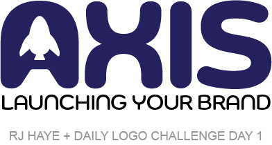
I opted to go with a branding or marketing agency on this instead of a typical space-related company because, honestly, it just felt right. It’s a little playful, with a serious name, which seems very marketing agency to me. I chose the dark blue almost purple color because it reminded me of deep space without being too dark. Plus it leaves a lot of options open for complementing colors.
Things I might refine:
The rocket shape itself needs a little bit of adjustment I think, though the simplicity of it might scale very well. If it were a real-world scenario, I might consider replacing the tagline with “Marketing” or something as well, to better define the “company”. Other than that, I’m pretty happy with the way this turned out!
Day Two: Hot Air Balloon
The prompt for day two was “hot air balloon”. The name ideas given were Lift, Crown (the very top part of the balloon), and Whoosh, and the prompt noted that it should be a “fun and whimsical project”. I decided right away to go with “Lift” and knew I wanted the “I” to involve a hot air balloon, though I did consider using the “W” in “Crown” as part of one as well. “Lift” seemed like a better fit. For this one, I did search out an image of a hot air balloon to use for inspiration.
My day two design:
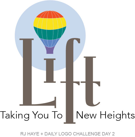
Hot air balloons often make me think of steampunk, so when I was looking for a font to use I wanted something that would work in that world. The dot above the “i” in this font was a shape that immediately made me think of a hot air balloon, so it seemed meant to be. I did a lot more adjusting to this font, notably changing the serifs a bit, shortening the “i”, and lengthening the bottom of the “f”, as well as adjusting the spacing a bit. I shortened the “i” to both illustrate lifting up, but also so that it looks a bit more like the basket of a hot air balloon.
I drew the balloon using a widened version of the dot of the “i” and a circle I smooshed (not the technical term) a bit. The lines were just ovals I drew. Then I made it all into a compound shape and colored it in with a modified rainbow palette. It felt very stark to me, so I added the light blue circle behind it, which brought everything together nicely, adding an additional layer of visual lift that really pleased me.
I added the tagline “taking you to new heights” because I felt like it balanced things out nicely. I really liked the “grounding” of the lengthened “f” but felt like it needed a little more balance down low.
I didn’t really have a specific company in mind for this one, but feel like it would work for, perhaps, an education center. Overall, I like the way it came out.
Things I might refine:
While I do really like the result here, there are a few things I’d polish up. First, I’d adjust the lines in the balloon to better flow with the shape I have. Right now, the line between the green and the yellow is a bit low for me. I think it would work better if the line between the red and the yellow was a bit deeper of a curve, and maybe if the green/yellow line was a bit shallower. I’d also make those lines a bit thicker so that it scales better.
Next, I’d maybe flip the curved parts of the arms on the “f” and the “t” so they point upwards, creating more visual lift. With them pointing down, it drags things down a bit. Flipping them would probably work really well. I might even make the arm on the “f” straight and just have the “t” one curving up. I’d have to play with it.
If I were to nix the tagline, I’d move the crossbar of the “f” up a bit and pull the bottom up a little bit more and see how that looked. Again, this would create more visual lift which would work well with the “company” name.
Day Three: Panda
The prompt for day three was “panda”. The name ideas given were noted as “nonprofit” and were Panda Global, Bamboo, and Endangered Panda Conservation. I opted to initially just start playing with the word “panda” and see where it took me. I pulled up an image of a panda bear, bamboo stalks, and bamboo leaves for inspiration. I did not expect to end up going the direction I did, but… well… here’s where I ended up.
My day three results:
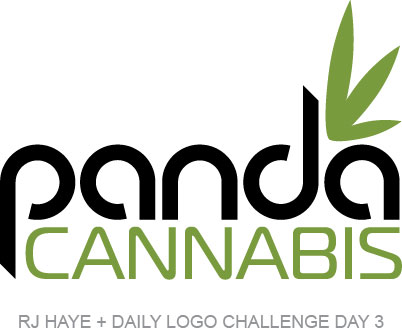
I initially chose this font, which I modified just a little (extending the bottom of the “p” and the top of the “d”) because the shapes made me think of rolly polly panda bears. I was going to go the “Panda Global” route and have it be some sort of corporation, but looking at the bamboo leaves I thought “what if ‘Panda’ were a high-end cannabis dispensary”. The bamboo green and the shape of the leaves worked nicely for it, especially once I created a marijuana leaf and cut it in half. I played around a bit and ended up here.
In my head, this storefront has bamboo wood fixtures, glossy white walls, and lots of glass. Deep green carpeting reminds you of a bamboo forest floor while muffling footsteps. It’s not as brightly lit as an Apple store, but the ceiling is one big lightbox emitting a warm, natural light. The logo is mounted above the counter and backlit brightly. There’s perhaps a wall of bamboo somewhere, either real or artificial. It’s calming and quiet, with brown noise softly playing. But it’s not kitschy or cliche. Just relaxing and expensive-feeling.
What I might change:
I don’t think I change anything here. As I mentioned above, I played around quite a bit with some other options on this one. I had a full marijuana leaf above “Panda” at one point, but the ascender of the “d” got in the way and made it look off balance. Centering it on the “pand” didn’t look right either. I looked at doing a more obvious bamboo leaf and a marijuana leaf together, but it was off balance that way as well. I drew black eyes, ears, and a nose, using whitespace to create the illusion of a panda, but it didn’t really fit anywhere. Adding it with two clumps of three leaves or a full marijuana leaf made it look more whimsical and cute than high-end, and I wanted to stick with the high-end look. I even tried “dispensary” instead of “cannabis” but it didn’t work as well, possibly because the soft “a” sounds in “panda” mirror those in “cannabis”. I settled on this, tried other stuff, and went right back to it quite a few times.
I didn’t keep any of those variations, though if I were working on it for a client, I probably would have in case they came back and wanted to see those options.
Day Four: Single Letter Logo
Day four’s prompt was to design a logo featuring a letter of your choice. It stated that the logo could be be any letter (if you were having trouble choose an initial from your name). It could be for a major corporation or a personal brand.
I had a similar assignment in my college graphic design class that I struggled with big time. I hated everything I sketched and ended up “phoning it in” by layering some fonts. I still have it and revisited it after completing this. It’s awful! But since then I’ve struggled a lot with logos made from my initials. Particularly “R” because I have a hard time finding one that appeals to me but also feels “me”.
So this time I decided I’d go with a “H”. I figured I could have a little fun with it and, I dunno, make something that might be cool to put on a piece of wood and hang up in the house or something. And then while digging through my fonts I came across this super narrow “H” and immediately knew I was going to make an “R” using that “H” and a “J” (and also a “C” it turns out). A few minutes later, and some tweaking to get things just right, and…
My day four results:
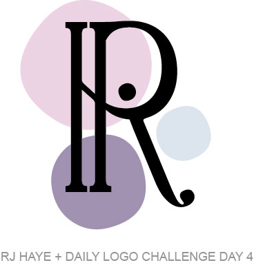
I was pretty happy with this initially, but took the dot of the “J” and added the colored dots behind to soften it a little. I chose muted versions of two of my favorite colors (hot pink and sky blue) to go with my favorite lavender color. I had initially thought it would be cool to match my skin, eyes, and hair to Pantone colors but that’s way harder than it looks when you’re working alone. The not-quite-roundness of the dot works really well with the crispness of the logo. I thought it was done and sent it to a friend and when I saw it small I decided to go back and adjust the crossbar of the “H” so that it followed the curve a little better, and that was it.
What I might change:
Nothing! I love this one so much I’m considering rebranding everything and using it! And that says a lot because I really like my current personal branding. But maybe it’s time…?
Day Five: Driverless Car Logo
Just when I thought this was going to be easy this challenge throws out the driverless car logo prompt, saying, “The future is here and autonomous cars are the next big thing. Design a driverless car logo. You can take a traditional car logo direction or focus on a sleek startup design.” They also offered some name ideas: Autonome, Vrooom, and Onward.
This one was tough. My husband worked for a company that was working on an autonomous vehicle, and we lived in Phoenix near where Waymo has been developing their autonomous vehicles. I know maybe a bit more than the average person about some of the struggles the industry is facing, primarily the lack of public trust and hesitation regarding the technology. We are also what you would call “car people”, with deep personal ties to both automotive racing and a love for cars. I wanted to create something that could work in multiple instances–as a corporate logo, as a vehicle name, and on a vehicle itself–similar to how many of today’s car manufacturer’s work.
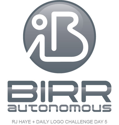
My day five results:
I struggled a lot with this one. There was no “quick and dirty” about this one like the others. I ended up spending a couple hours, easily, on this logo. I started out by rejecting all the name options given and instead heading over to the thesaurus and looking for synonyms for words like “go”, “drive” and “forward”. I started noting words that stood out to me and looked up the actual definitions of them when I had a few I liked. “Birr” stood out to me for multiple reasons. For one, it rhymes with “whirr” which is sort of the sound an electric vehicle makes. And then there’s the definition:
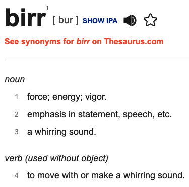
And with that, “Birr” was the name of my autonomous vehicle company. That was the easy part.
From there I started playing with the letter “B” in various fonts, similar to how I started the previous day’s project. I was envisioning a badge for the grille or hood of a vehicle and wanted something simple that would be easy to recognize. I stopped when I saw the curvy “B” that makes up part of what I settled on. The lines reminded me of a race track. I paused there and around for fonts for “Birr Autonomous”. I settled on one, but ended up rounding off the edges of the letters (minus the ends of the “R”s) to make it work better with the curvy “B” I liked for the badge.
Then I got to work on the badge. I played with a lot of variations, and even used the letters in “Birr” to create a race track shape. I played with ovals and circles, too. But in the end, this logo won out. Some of the versions I created were too “windy” and I didn’t want the consumer seeing them and thinking they looked out of control or dangerous. With the current hesitation about autonomy in vehicles, that seemed like a terrible idea. This curvy “B” with the “i” that looks sort of like a person facing backwards works for me. I added a sort of metallic effect to the letters and a bubble-like look to the badge, adding a bit of dimension, though both work well single-color also.
What I might change:
In the end, I’m not sure on this one. If I were working with a client, they’d have gotten this and the three other versions I created and a request for feedback. But since I suppose I’m the client here, I settled on this one. I don’t know if there’s anything I’d change about it, mostly because I know the process of how I got here and how many variations it had. I like it, overall.
Overall thoughts up until this point.
I am so glad I started this project! I’m hoping I can see it through. Day five was a Saturday, and when my work week ended I didn’t anticipate working on this until after the weekend. But Saturday morning I woke up, checked my email, and was excited to see a prompt early in the morning. Typically I don’t like spending weekends or really late week nights on the computer… it’s a boundary I’ve set for working from home. Perhaps getting a rainy day helped this weekend, but I was eager to sit down to work on a little project on an “off” day. I’m looking forward to continuing flexing my creativity for another 45 more days!