Part 3: Days 12 Through 17
Coming off the disappointment of the eleventh day’s prompt was pretty easy when I saw the twelfth one in my inbox. I’ll spare any other thoughts on things and just start talking about the challenges…
But wait!
Before we get into it, I have exciting news about what I’ve decided to do with this project! After myself and a few others expressed “gosh that’d be so great on a t-shirt” I decided to go ahead and open a store called Faux Logos. I’ve made a few select logos I’ve created available for purchase on shirts (and some on drinkware). I’ve requested to unlock some other products, so I’m hoping that comes through soon. So a fun little side project has come out of this fun little side project!
Ok moving on…
Day 12: Airline
The twelfth day’s prompt was “Airline”. It came with the following name ideas: SkyBound, Pioneer, and Airtrack. The prompt also mentioned Delta, Emirates, and Lufthansa as the “giants” in the business and asked, “what if there was a brand new up-and-coming airline which had the possibility of beating out the airlines of today? What would their logo look like?”. It also included the following quote from Leonardo da Vinci:
“Once you have tasted flight, you will forever walk the earth with your eyes turned skyward, for there you have been, and there you will always long to return.”
I initially wanted to use “Skyward” as my airline name, and thought using the “W” to show an airplane taking off would be cool. But I looked at the logos for Delta, Emirates, and Lufthansa and none of them actually had an airplane in them. For good measure, I also looked at United Airlines and American Airlines. Same deal there. So I scrapped that idea. I ended up going with PioneerAir.
Here is my day twelve logo design:
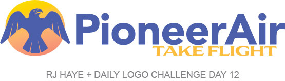
I kept the typeface simple. I chose the one I did because initially I was going to angle the “E”s a bit so they mimicked the angle of a plane during takeoff, but it didn’t look right. The eagle is a modified dingbat from a font I recently shared with a colleague looking to make his own business logo (which I also used a variation of for the tagline). I opted for a sunrise color gradient and used the gold color for the tagline. I chose a more muted blue to give sort of a vintage feel. I can definitely see this logo being one from an airline back when commercial air was still a novelty, and I like that about it. Maybe this airline brings some cool things from back then back.
Things I might refine:
The yellow of the tagline is a bit hit or miss and maybe I should darken it. I tried the orangey color and didn’t really like it. If this were for a client, I’d maybe work a bit more on getting the orange and the golden yellow dialed in so they worked, but for this, it’s fine. Outside of that, I’m pretty happy with this one and opted to add it to Faux Logos.
Day 13: Barbershop
Day 13 came with the prompt “Barbershop” and the name ideas Cleaned Up, Ross & Circle, and Bob The Barber. Having done a logo for a hair stylist friend of mine, Jacquelyn Marie, I opted to use this opportunity to think about what I might have done if she was a barber instead of a hair stylist and makeup artist. This is what I came up with.
My day 13 results:
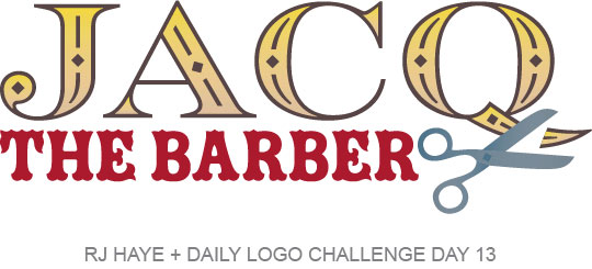
I went with the same Americana-style tattoo vibe as I did with her original logo, but kept this one a little more clean and simple. As I was making it, I noticed the tail of the “Q” looked a bit like a loc of hair. I added the scissors and made it look like the tail had been cut off, for a little whimsey. I love the results and envision her barbershop having dark wood, deep read leather chairs, and an old-school, calming atmosphere where clients can relax while she cuts their hair.
Things I might refine:
Originally I thought about adding more Americana-style tattoo elements… maybe a rose or a swallow? But in the end, I’m pretty happy with the way this came out. Those kind of elements can always be added as extras to accentuate the logo, but not be part of it. It too is available on apparel in the Faux Logos store.
Day 14: Cloud Computing Logo
On day 14 we were graced with the prompt, “Cloud Computing Logo”. The name ideas were Cumulous, Precipitatio, and Zip Cloud. It also noted that, “Today’s cloud computing industry is very competitive! Make sure to quickly look at the competition and get inspiration for your project.” So I immediately thought of cloud storage, like Dropbox and Amazon Web Services. I opted to go that route with things for this one. It might not quite be what we were being asked, but when I saw the “N” for one of the fonts in my database, I knew what needed to be done.
My day 14 results:
The shape of the “N” reminded me of a lock, so I built one that’s also a cloud. I called this secure cloud storage company “Nimbus”. This logo took shape pretty quickly.
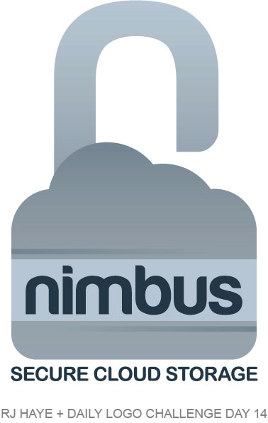
I chose stormy blue-greys for this one, and used gradients to create some dimension and separation. Overall, I like it.
Things I might refine:
I’m not sure on this one. Part of me wants a bit more “noisy” of a gradient, but I am purely working in Illustrator and only know how to do that in Photoshop. I might have been able to figure it out or create something similar to what I was thinking would look cool if I spent more time on things, but I’m still trying to keep things “quick and dirty”. This one is just ok, in my book. It’s not in the store right now.
Day 15: Hand Lettering
The 15th day of the challenge brought the prompt to do a hand-lettered logo. It said to choose any business or personal name and to really look at how the letters are organized and connect. I have tried hand lettering a few times and it is not my thing. I knew right off the bat that I’d be making this one digitally with a font I found that suited my plan, and that’s ok!
One thing I really liked about this particular challenge is that it came with a bunch of great resources for learning and inspiration. the Daily Logo Challenge shared a course on hand lettering from Skillshare, as well as some quick tips to get started. There were also links to samples on Dribbble, Canva, and Behance. And (though I opted to use Adobe Fonts), there was also a link to a collection of 50 free handwriting fonts from Creative Bloq. I didn’t look through anything ahead of time because I didn’t want to color my decision on this one. But I love that there were so many resources and tools sent with this one! I hope future challenge prompts include more stuff like this.
My day 15 results:
This one took shape pretty quickly. I decided to do a logo for my uncle Kerry, who makes (but doesn’t sell) cheesecakes. He doesn’t make them often, but when he does they’re quite tasty! So “Kerry’s Cheesecakes” was born.
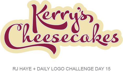
I chose a deep cherry red for the lettering, which was a font that I made some minor adjustments to and use some letter variations instead of the standard options in some places. I outlined it with white, a pale caramel color, and then the most cheesecake looking color I could find in the Pantone book.
Things I might refine:
I’m pretty happy with this one. So much so that I sent it to Kerry and added it to apparel and drinkware in the Faux Logos store. I did play around with different colors for the lettering and the thin tan outline, but this color combo worked the best.
Day 16: Fox
On day 16 we were asked to design a fox logo. The prompt noted that foxes often symbolize cunning, quick-thinking, and cleverness. It also suggested the names Read Fox, Reynard, and FOXOF. I went pretty literal with this one.
My day 16 results:
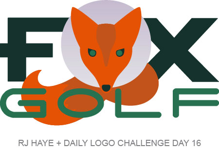
This one took shape pretty organically. I had originally wanted to go a different direction, but wasn’t quite feeling it, so I just let this happen. I drew the fox head using shapes and the body and tail are actually from a font! I modified the “F” and the “G” a little bit. I’m sort of meh on this one, but they can’t all be winners, can they?
Things I might refine:
First of all, I showed this to my husband who immediately asked why the fox was wearing a cone of shame, which I now can’t unsee (and neither can you). I had placed that circle so there was separation between the head and body, and thought it was cute, but now a cone of shame is all I see. So I might start by dropping the circle back behind the fox body and not just the head. I’d also modify the “F” in “golf” a bit so both of the arms weren’t the same length, similar to the “F” in “fox”. Outside of that, I think that’s all I’d change. I don’t love this enough to put it in Faux Logos, though. At least not yet.
Day 17: Geometric Logo
Geometric was the prompt for day 17. The provided name ideas were Vine & Berry, Delta, and Arc. When I saw “Vine & Berry” I knew what had to be done…
My day 17 results:
I knew I wanted to do a geometric bunch of grapes, so I played with pentagons and hexagons and decided this arrangement of hexagons got it across pretty well. I also learned that seven-sided shapes look very strange… septagons, I guess? Oddly enough, seven hexagons look enough like a bunch of grapes to make this work.
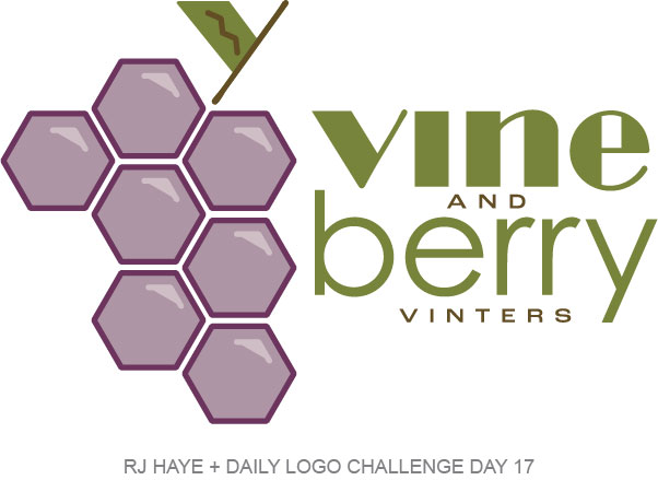
When I was looking for fonts the other day for the hand lettered logo I came a cross a few others I liked, so I activated them. The one I used for “vine” and the grape bunch stem here was one of them. An olivey green and a greenish brown work nicely together. I was going to leave the grapes just outlines, but opted to color them in and add accents, which are just snippets of the hexagons downsized with all but 3 points deleted. I used the same 3 points, doubled, to create a little accent for the leaf. I was going to use a hexagon for the dot of the “I” but totally forgot until looking at it right now. But I like it without.
Things I might refine:
Since I totally forgot about dotting the “I”, I might go back and look at doing that with a small hexagon, as I’d originally planned. I might also look at swapping the brown and the green for the lettering… it might make more sense to have “vine” and “berry” darker and the “and” and “vinters” lighter. But overall, I’m happy with this one. Haven’t decided if it will make it into the shop yet.
Thoughts on things so far.
The last five days of this challenge have been better for me. Adding the Faux Logos store has brought even more fun into it, as did getting to do a logo that I could “give” to someone who would find more joy in it (even if they don’t use it). I had fallen behind, and did some of these in one day. I anticipate that happening as life gets in the way, and that’s ok. I don’t plan on skipping anything right now, and as I write this, am almost entirely caught up (I just have today’s to do). And I took a sneak peek at today’s before I finished day 17 and am quite excited because I’m going to use it to make another logo for a friend, which is fun and exciting. I’ve also had a few other friends make requests for things (mostly relating to inside jokes) and I hope I get the opportunity to make them as the challenge continues!