
Part 4: Days 18 Through 23
Despite falling behind on the weekends, I find I’m looking forward to getting the prompts for the Daily Logo Challenge, even when I know I won’t be sitting in front of my computer working on them. I think the increased fun of adding the Faux Logos shop has helped drive me to make interesting stuff. I’m still trying to keep these “quick and dirty” and am not spending a whole lot of time on them because of it. There definitely have been logos I haven’t included in the shop, which is fine. Overall, I’m still enjoying the challenge and the creativity!
Day 18: Cupcake
For day 18 we were prompted to design a cupcake logo, with Betty’s Bakery, CakeCup, and Frosted offered as name suggestions. I, however, knew I had to design a logo for the cake company a friend and I would have started in high school if we were so inclined. It’s not the most creative name, but it was a fun one to do nonetheless.
My day 18 results:
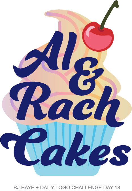
This was a challenge, because while I knew what I wanted to do, I had no idea how to execute it. I started with what I knew how to do… the base of the cupcake and the cherry. For the frosting, I ended up using an ice cream cone emoji and tracing the soft serve part to start. This one: 🍦 I then adjusted the swirl a little to fit what I wanted. Then I used the free form line drawing tool to create the swirls, which I also sort of traced from the emoji. I opted to just use a gradient to fill both layers instead of trying to make it look like actual swirled color. A dark blue for the font, which has some modifications, adds nice contrast.
Things I might refine:
If I were worked on this for a client who wanted a more swirled color look for the frosting, I probably would have found an image online and worked to build it with shapes somehow. But for my purpose, the gradient trick worked fine. Other than that, I don’t think I’d change anything. I liked this one enough to add to Faux Logos, both on apparel and mugs.
Day 19: Kangaroo
Kangaroo was the day 19 prompt, with a note about the kangaroo being an iconic image for Australia. We were asked to create a “kangaroo logo that will be the next best thing” and offered the name ideas Hopo, Heaps, and Sunnies. This was a tough one for me, because I’ve never drawn a kangaroo and wouldn’t really know where to start. Plus, I know there are a couple of logos out there that use a kangaroo. I tried to steer clear of looking for them so I wouldn’t be too swayed in my design.
My day 19 results:
I started this one planning on doing an eyewear line called “Heaps Sunnies”. I found a font that I really liked for “Heaps” and then went on to tackle finding a kangaroo. I was able to find a font that had one that I could use as a base. I made quite a few modifications to it, including shaping the back and tail so it was the same shape as the “S” in “Heaps”. As I worked, I decided activewear made more sense than sunglasses, so I made that change.
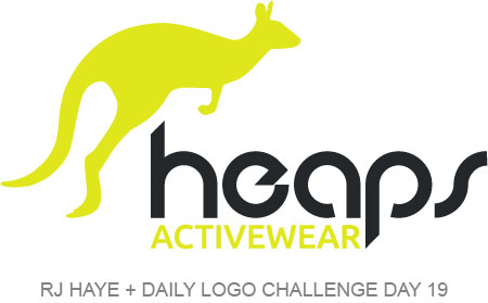
I chose a bright neon yellow for this one, with a dark grey–nearly black–for the name. I’m pretty happy with it and it did make its way into the store.
Things I might refine:
I don’t think I’d refine anything, but I would like to play around a bit with other variations of this. I’d love to see the brand story develop here, choose accent colors, create other variations (a more vertical look, just the wordmark, and a standalone kangaroo), and choose sample imagery. This is really the first logo I think I’ve done for this project that I feel that way about… maybe because it’s a little closer to my dayjob than anything else I’ve created? Not sure. But it sure would be fun to fully develop this brand!
Day 20: National Park
For the 20th day of the Daily Logo Challenge we were tasked with designing a logo for a national park. The name ideas given were Pikake National Park, Lincoln National Park, and Cloud National Park. The prompt also included the reminders that, “National park logos are often created to look like a badge. Remember where the logo will need to be used. It will need to appear in small format on forms and tickets. It will also need to be on clothing and park maps.” All very helpful!
My day 20 results:
I decided to use a different name than those suggested, mostly because I’ve enjoyed creating logos that have a little more meaning to me. For this one, I wanted to incorporate my dog somehow, so I started with her name: Kirby. “Kirby National Park” didn’t do it for me, and I started thinking about other words I’ve come across in our adventures… and of course settled on “Bottoms” because it made me chuckle. And thus, the picturesque Kirby Bottoms National Park was born.
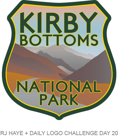
For this one, I actually took a couple photos of Kirby and sampled some colors right from her to use. The mountains and road are a loose tracing of this image from Pexels. I was going to try to actually use elements from Kirby herself, but I couldn’t quite visualize toebeans and teefers in a way that made sense here. I added forest green and bright golden yellow because those colors always make me think of National Parks. This one definitely made it into the Faux Logos shop, on apparel and hats!
Things I might refine:
I like this one a lot. If I were actually creating this for a real national park, I might play with other variations of it, as I’m not sure this would translate well to tickets, business cards, and some merch. But overall, I really like the way it came out.
Day 21: Granola
The prompt for day 21 was to design a logo for a granola company. We were offered the name ideas Crunch, Yumm, and Pack & Trail. This prompt also came with some helpful advice, reminding us that it’s great chance to think about target audience. Specifically, the email asked, “Will your brand be designed for hikers, soccer moms, or businessmen skipping lunch? When concepting think about who will use (or eat) your product. Design the logo so they recognize that the product is for them after a quick glance.” It’s always great to be reminded of stuff like this, especially when working on projects that are outside what I normally do.
So, for this project, I thought about what someone like a vegan-leaning friend of mine might want in a granola. Something healthy and plant-based, yes, but also something fun and not boring. Ideally not gross-tasting either, but that’s not really something you can work into a tagline in a way that’s tasteful (ha), and I have a weird distrust of things that say they’re good… so often they’re not. So anyway, that’s the logo I set out to create using the “Yumm” suggestion offered.
My day 21 results:
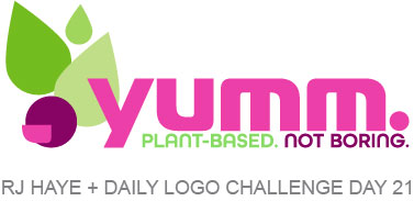
I chose colors that were bright and fun, and different from what I’ve typically seen on granola brands. I wanted something eye-catching and more horizontal, to work nicely on a bar wrapper. I thought about (thought didn’t deep dive and do any research) brands I’m familiar with and the colors they use. I opted to go with a bright magenta and a deeper berry color along with a trio of fresh-looking green colors. I don’t think that there’s a granola company out there that uses these colors, which means this would immediately stand out on the shelf. I created a happy little berry using the inside shape of the “U” and overall, I’m happy with the design. I intentionally left the word “granola” off so that the brand could expand into other plant-based items. Maybe down the road there’s a line of smoothies or something.
Things I might refine:
I like this and have added it to Faux Logos (along with a different variation that works better on a water bottle and totebags). I think the only thing I might refine would be the two lighter greens. They’re a bit closer for my liking… but I do like the subtlety of the difference. So that would probably be something I’d leave up to a client.
Day 22: City Logo
The prompt for day 22 was to design a city logo, with the fictional city names Greenflower, Torrine, and Fernsworth offered. Apparently, it’s trendy for cities to have logos now, but I’m not really sure how new of a thing this is. The town I grew up in has always (as far back as I can recall) had a logo. But anyway…
I was originally going to do a tongue-in-cheek Nashville logo that called out how it’s become a huge bachelorette party destination. Then I thought about Nashville itself and some of the things that make Nashville *Nashville* and thought about playing with a design similar to one I had on a shirt as a kid, where “Chicago” was made of Chicago landmarks. But I couldn’t really think of a way to do that that didn’t read “tourist shirt” and not “city logo” so I opted instead to just create a logo for Fernsworth.
My day 22 results:
I started this one pretty much how I started my other logos… by choosing a font. This one hit me right away. Then I got stuck. I did a quick Google of “city logos” an didn’t find much outside of skylines. So I decided I was going to go that route and started using shapes to draw buildings. But I wasn’t feeling it, so I looked through dingbat fonts on Adobe Fonts. And I found one that had some buildings in it, and I’d already had it activated. I added all the buildings to my working document and saw one that was a boat and a building. I also liked this clocktower thing and something at the top of a couple other buildings. So I combined them all and ended up with this.
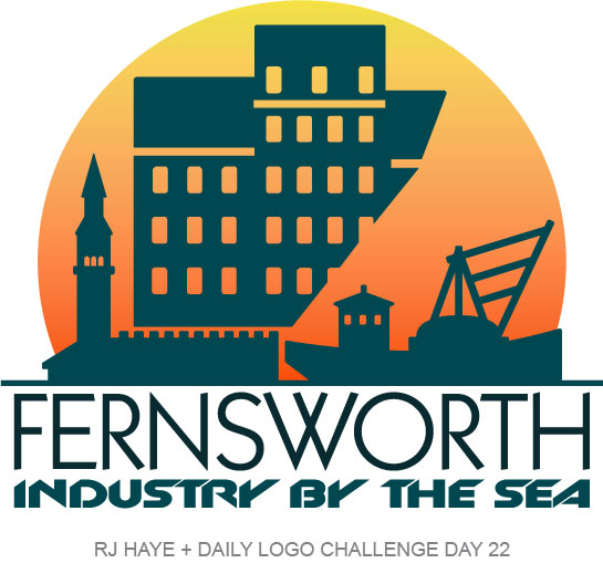
Adding the sun behind really pulled it all together for me, as did the “Industry by the Sea” tagline I came up with. For that I went with a angled, blocky font that really said “industry” to me and offset the more art deco-ish font I chose for “Fernsworth”. For colors I went with a very deep blue-green that reminded me of the depths of the ocean and an even darker (nearly black) version of the same color. The sun is a gradient that reminds me of the colors of the setting sun, which creates nice contrast.
Things I might refine:
This one was tough. I’m not sure I love it, though I did add it to Faux Logos on shirts and totes because I also don’t totally hate it. I had wanted to do a linear effect in sun with color blocks, but couldn’t get it to look right with the windows and the breaks in the buildings. But without the breaks and windows it was just a block of color. I tried doing a gradient on the foreground as well but didn’t like it. I might make “Industry by the Sea” a lighter grey. Overall, the things I’d play with are things I’d already tried… but perhaps there’s a variation I hadn’t tried yet that might look better. If these weren’t “quick and dirty” fake logos, I’d for sure spend more time on it.
Day 23: Boat
This one was fun and a bit unexpected. The prompt was boat and some name ideas were Foata, Star Point Marine, and Open Waters Yachts. It wasn’t specifically a boat company logo, but instead noted that it was “for whatever purpose you choose”. I decided to design a logo using the name “SandRay” which was the unofficial name of the boat my family had when I was a teenager. They always say you should name a boat after the woman in your life so my dad said ours was “SandRay” after my mom and me. We never actually painted the name on there, but for the 10 or so years we had the boat, that was the name.
I started this one looking at logos for companies like SeaRay, Malibu, Mercury, SeaDoo and Yamaha. But I quickly abandoned that and decided to go with something less “corporate boat manufacturer” and more “fun watersports company”. So I ended up with this…
My day 23 results:
I knew I didn’t have anything in my font library that would work for what I was thinking so I took, once again, to Adobe Fonts to see what I could dig up. This one was on page two or three of one of the categories and I knew immediately it would suit my vision.
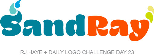
The playful nature of the font alone would have worked, but I wanted something that said “watersports” and “beach” a bit more than just a playful font. I added it upward “wave” on the “S” using another shape from the same font and modified a comma to make the water drops. Initially I had the letters and drops all the same turquoise blue, but it didn’t look right to me, so I added the orange-red and made the drops above the “Y” lime green and lemon yellow, as those colors always make me think of summer.
Overall, I’m pretty happy with this one. The logo would have looked good on the back of a boat as a name (though perhaps all in black on our particular boat, since these colors would have completely clashed with its red and grey colorscheme) or on the side of a boat as a brand. But it would also look great on a tube, life vest, or pair of waterskis. This one is a success… but I’m not sure it’ll make it into the store.
Things I might refine:
One thing I struggled with this is that there’s no defining what kind of company SandRay is. It looks water-related, but is it swimwear? Sunglasses? Watersports? I would probably figure out a way to specify that on this logo if I wanted to spend more time on it. That said, It could also be all of those things, and maybe that’s part of the brand story.
Continued thoughts on the Daily Logo Challenge.
I am behind on this… both creating logos and blogging about them. Life has gotten in the way. I have a week’s worth of prompts in my inbox that I haven’t even begun to touch. But that doesn’t mean I won’t do them… I just have to find the time.
I’ve also found myself designing things that I think will look good on a shirt, specifically for the store. And that wasn’t my intention at all when I started this project. It’s something I need to get away from, I think, because while merch can be an important part of a brand, it’s certainly not a part of every brand… and a lot of times the logo itself isn’t part of that story.
Other than that, I am enjoying the challenge still and look forward to finding the time to continue creating!