
I’m quite far behind on this challenge. Life certainly got in the way… as did not wanting to spend much more time in front of my computer than necessary some days (especially on weekends). But I’m still plugging away and working on logos here and there! I will absolutely be finishing up all 50 prompts. I’m really enjoying the challenge presented, the opportunity to learn new things and hone skills I already have, and continue to familiarize myself with Illustrator. I’m fully self-taught in Illustrator and learned on the job starting only about eight or nine years ago, so having the opportunity to try new things, learn shortcuts, and further familiarize myself in the program is a big help for me. Anyway, let’s move on to days 24 through 29 of the challenge…
Day 24: Bicycle Shop
For day 24 we were given the prompt “bicycle shop” with a few name ideas. Those were SterHip Bikes, Peddle Power, and Geared UP. I didn’t particularly care for any of them, honestly. Instead I decided to take a page out of my husband’s book and went with Gear Werx. Once upon a time he owned a company with a name that ended in “Werx” so I thought this was sort of a fun nod at that.
I actually came up with two logos for this one. A full wordmark for one version and a “GW” version. Here, I came up with the wordmark first and then, in playing around, came up with the secondary mark. I had initially thought about doing the words under the “GW” but liked it as a standalone. I liked them both a lot and kept them both, thinking about the reasons a bicycle shop might want two logos like this. Things like stickers and apparel came to mind, of course, but also store and event signage… it would even work nicely on the back of a business card.
My day 24 results:
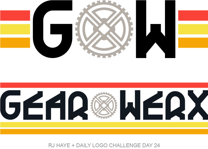
The font I chose was one I had. I don’t believe I made any modifications to it. The gear was made with a doodad from another font, which I combined with some boxes I made and rotated. I’m really pleased with the way it came out!
For colors on this I went with a warm grey. My gut had been to go cooler on the grey, but that’s what I always do, so I decided to do something different. To coordinate, and to add some color, I chose to add three color bars in a bright orange red, golden yellow, and orange. The three lines were initially added to the “GW” version, but I added them around the wordmark after. I’d played around with it and decided the splitting up of the three lines to surround the logo worked a little better than adding the lines off the side or behind the lettering.
Things I might refine:
On this one, not much. I like it enough to add it to the Faux Logos shop (eventually). Heck, this is one I sort of wouldn’t mind fully developing a brand on… and if it were for a client, I for sure would. But since this is just a logo challenge, I’ll leave it as is.
Day 25: Photographer Logo
The prompt for day 25 was to design a logo for a photographer… specifically “someone looking to take their photography to the next level”. There were name ideas as well: Lenns, Capture, and Dark Room Studio.
At first I was going to design a logo for a friend’s photography business. They used to shoot on the regular but now only photograph the occasional wedding. But after tooling around a bit, I decided I couldn’t really come up with something I particularly liked, so I scrapped it all and went with Dark Room Studio.
My day 25 results:
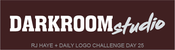
Looking at this, it feels a little phoned in. But I tried to think about what would look good and stay readable as a watermark on digital photos… one of my biggest pet peeve when I’m looking at a photographer’s work online is seeing a watermark that’s nearly illegible. I wanted something crisp and clean.
I also thought about what kind of work this photographer might do. Things like weddings, sports photography, and various portraits are generally the moneymakers for photographers, so I opted to do something that would work best for sports photography and portraits. Frankly, the friends I have who have shot weddings before say it’s a huge headache, and I wouldn’t want to have any part of that myself, so yea.
I kept the colors pretty simple, opting for white and a light cool grey. I wanted to make sure the logo would stand out on a photograph, and I always feel like a lighter watermark at 50% opacity works better than a darker one, for some reason. So I kept that in mind. I opted to put this one on a dark background for that reason and chose a warm toned black that reminded me of what you might see in a dark room.
Things I might refine:
While I sort of feel like this is a little basic, I am not sure I’d refine much. If I were working on this for a real client, I might come up with a vertical version as well as this horizontal one, and perhaps a square or circle one for social media avatars. I’d had a cool camera outline drawn that might be neat to use for that, actually. But overall, the logo itself, I like quite a bit. Not enough, however, to put in the Faux Logos store.
Day 26: Paper Airplane
Paper airplane was the prompt for day 26, with name ideas offered again. Those were Glide, Airio, and UpToss. I chose Glide and dove in to finding a font.
My day 26 results:
I had originally been hoping to find a cursive font that was legible. My vision had been to have a paper airplane coming off the tail of the “e”. But the font I decided on was light and playful enough that it worked for me. It’s like graceful pen strokes, or the lines a paper airplane might follow in the air. So with that chosen, I sent to work making a paper airplane, digitally… which is an odd sentence to type out.
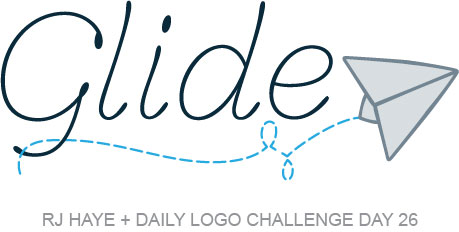
I created the airplane using symbols from the same font. I believe I used a “<” and a “|”, as well as a “v” for this. If you ask me, it came out pretty perfect. I then used another decorative wingdings font to find a curved line, which I outlined with a dashed stroke and then deleted one layer of. It hadn’t been how I was planning on doing it, but it worked out nicely and created the perfect flightpath for my paper airplane. If you look closely you’ll see that it loops over and then under the bottom part of the “G”.
I settled on a very dark blue for the word “Glide” and a blue-grey for the paper airplane outline, with a lighter version for the fill. For the flightpath I opted for a bright blue… the kind of color you see on a clear day when you look straight up.
I’m not sure what kind of company this is for, but overall, I like it.
Things I might refine:
Looking at it now, I might go back to that curved line and have the larger loop at the bottom and the smaller loop at the top. I feel like that would balance things a little better. I might also revisit the color of the paper airplane and the flightpath. I think lightening both of them might work well… or maybe adding a pale blue background instead of stark white would be better. A cloud shape, perhaps, could be fun. It would be worth playing with a bit more to refine this if I needed to. I decided not to put this one in the Faux Logos store either, for now.
Day 27: Ice Cream Company
I was on vacation when I did this one, but couldn’t resist. It was too much fun to pass up designing an Ice Cream Company logo! In addition to the prompt, we were offered the name ideas of Scooop, Moo Family Farms Ice Cream, and Snob Ice Cream. Moo Family Farms caught my eye and I thought of something, uh, udderly delightful…
My day 27 results:
For this one I thought of a few things: signage, packaging, and apparel. I wanted something that would draw people in if they were driving by a storefront or walking by in the grocery store. Something fun and obvious what it was at a cursory glance, that kids would understand right away and beg their parents for.
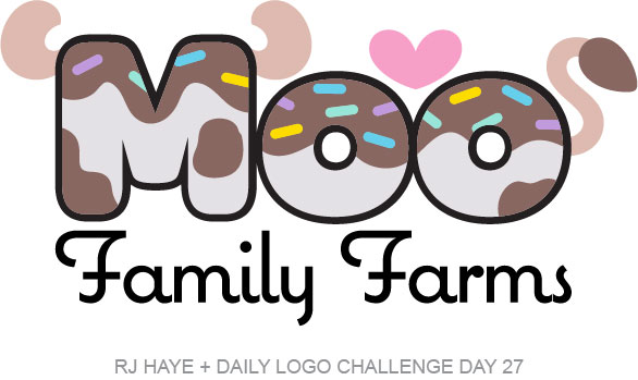
I started with a curvy, blocky font, which reminded me of how a cow’s “moo” looks (which is something that might only make sense to me, but that’s ok). I found a more decorative, playful font for “Family Farms” and then used elements from both of those fonts to create cow horns and a tail. I added a little heart, because who doesn’t love ice cream, but also because I liked the balance it added and the little pop of color.
Once I had all that down I played with spots. Initially, I just drew some standard cow spots in chocolate brown. It was cute, but it didn’t feel complete to me. So I drew the spots to look a little more like chocolate topping and added sprinkles. It was just what I was looking for!
Things I might refine:
Looking at this now, it sort of bugs me that I used black as the outline of “Moo” and for “Family Farms”. It feels a little heavy to me. I would perhaps consider looking at using a dark brown or a deep blue instead, to soften things a little. I think I was so excited about getting the spots and the sprinkles how I wanted them that I overlooked that part. But regardless, this one will for sure make it into the Faux Logos store.
Day 28: Hip Clothing Brand
The prompt for day 28 really spoke to me, but it ended up doing so in a way I hadn’t anticipated! The prompt was Hip Clothing Brand and the name ideas were Vault, Cloth, and Plain Threads. With the resurgence of 90’s and Y2K fashions I knew I had to go with Vault. My vision was immediately a clothing brand that took past trends and re-imagined them, starting with 90s wear. So I dove in.
First, though, I wanted to look at some current logo trends. I didn’t want to do something that was too dated. So I did a quick search and found an article at Digital Synopsis that showcased some trends for 2022 and one at Envato that did the same. I sort of kept those things in mind as I started designing… but I also thought about 90s trends I remembered and the overall vibe of the era and let that guide my direction more.
My day 28 results:
This one really took on a mind of its own! I thought about letters I used to doodle as a teenager and knew I wanted a really blocky font for at least part of it. I found the one used for “Clothing” here but didn’t like how “Vault” looked, so I turned to my handwritten fonts and settled on this one. I thought about doing a gradient on the letters and calling it a day, and while it might have checked the “on trend” box I decided instead that it needed some Memphis Style graphics to make it look more vintage. I did a quick search just to get a firmer idea of some shapes to play with and got designing.
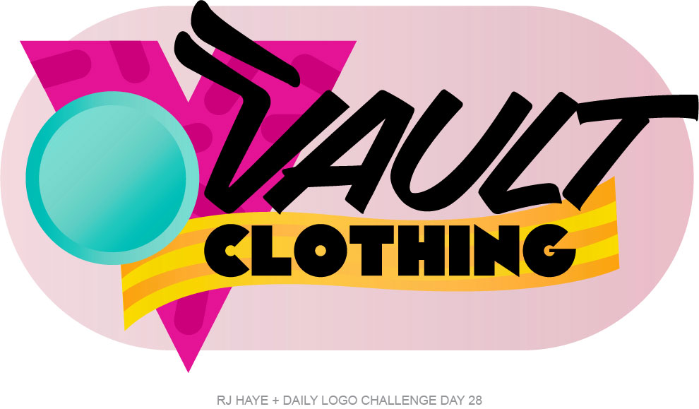
As I’ve tended to do with a lot of the logos I’ve designed for this project, I used shapes from a font to start. I really liked the “Clothing” font “V”, and it worked with the Memphis Style, so I started there. Then I added a “~”, which I ended up modifying a bit to make it fit where I wanted it to. I tossed in a circle and added, of all things, an equal sign from the other font I used. That ended up lining up with the top of the “V” perfectly, so that’s where it went. The rest I played around with until I got placement right, and then I started adding tonal elements for some dimension and further nods at the Memphis Style.
Finally I thought about how, as a teenager, some clothing companies had tags that were also stickers. So I added a pink pill shape behind it all, with a couple of the elements bursting out of the shape. I thought it would make for a cool sticker, a neat sign or label, and stand out more if it were on a piece of apparel or a hat. I used a lot of gradients throughout, for dimension. Overall, I’m happy with it. It’s certainly different from a lot of other stuff I’ve done!
Things I might refine:
This is tough. While I like it as is, it might only work if Vault Clothing sold 80s, 90s, and maybe early 00s style clothing. I also feel like it would become really dated really fast as is, despite my initial desire to not have something dated. I suppose both of those concerns could be remedied by adjusting the shapes and colors behind the logo, which could be a cool way to designate what era a piece was inspired by. So if I were moving forward with this, I would look at perhaps developing something that worked for 50s, 60s, and 70s clothing styles. That could be a lot of fun! As it is, though, I like it, and it will likely end up in Faux Logos.
Day 29: Rideshare Car Service
Rounding out the last five days’ worth of design prompts we have rideshare car service, with the suggested names Travis Bickle, Drive, and ShareCity. This prompt also said, “Uber and Lyft have revolutionized the transportation business. What will you do to separate yourself from the competition?”
I opted to go with “Travis” for this one. I liked the idea of having a rideshare service that sounded like you were calling a friend to pick you up. Think about it: “I’m a little buzzed, I better call Travis to pick me up.” I think it works pretty well!
My day 29 results:
I knew right off the bat that I wanted this one to be shades of greens. Green means go, right? So let’s go! I created both an icon (thinking in terms of an app and a window sticker or light of some sort for drivers) and a wordmark for this fictional rideshare service.
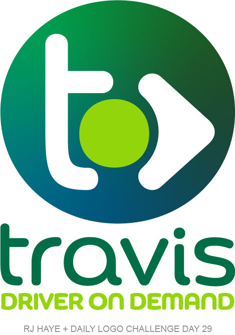
I went with a curvy font that I made a couple minor adjustments too… notably the “t” and the “i”. I wanted something a little softer and that felt friendly and comfortable, and this did that for me. I used two variations of it for “travis” and “Driver on Demand”, which is not something I typically do but I liked the way the all caps and all lowercase looked together. I added an arrow to symbolizing forward movement to the icon as well, though I couldn’t get it to work anywhere in the wordmark. I’m ok with that though.
For colors, I settled on a dark green and a bright lime for the main logo, which I brought into the icon. For some dimension, movement, and sticking with the gradient trend that’s in right now, I added a deeper green and a blue-green color. Overall, I’m happy with it, though I’m not sure it’ll make it into the shop.
Things I might refine:
I for sure missed an opportunity to make the dot over the “i” the bright lime green. I think doing that would tie it all together. Outside of that, I like this one as is.
Thoughts up to this point…
50 days is a long time. I’m still not at day 30 despite having received (and peeked at) all 50 prompts. But I’m not giving up! There’s some stuff coming down the pipeline that will be fun and interesting to tackle. Overall, I’m glad someone mentioned the challenge to me and that I decided to take it on!